Aug 3, 2015 Straightsell
Outdoing ourselves, the Straightsell team has travelled back in time to measure the traffic received by the Shared Server back in March 2015. As always we have analysed the mobile device usages of our customers' sites over a period of one week.
Regardless of the screen size or form-factor of the web device used to our customer's sites, the Straightsell 'Responsive Web Design' principles ensure our sites will provide a useful and effective interface no matter how customers access a Straightsell website.
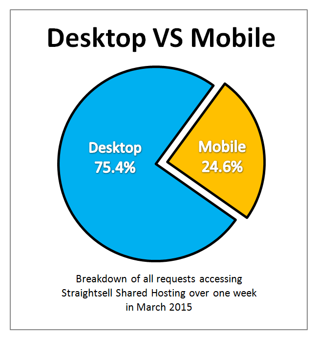
The following information was gathered by analysing all site traffic on the Straightsell shared server cluster for one full week in March 2015. Continuing the desktop/mobile split we have observed for the past 18 months, approximately 1 in 4 visits to the Straightsell Server were performed using a mobile device.
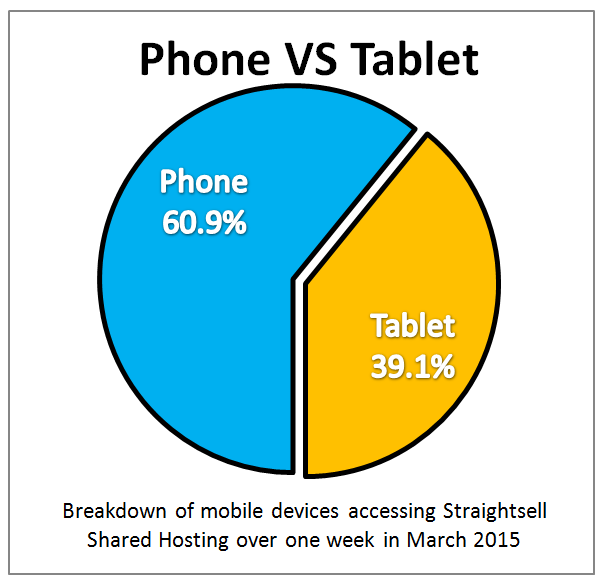
The difference in access volume within the mobile device category between smartphones and tablets continues to skew towards mobiles, now accounting for 60.9% of traffic:
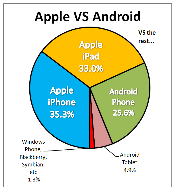
And finally, in the 'battle of the brands', Android devices continue to gain ground, increasing the share of mobile devices to 30.5%. Apple fell to 68.2% and the "others" remain largely irrelevant with only 1.3% of traffic.